
En français
This video Install R illustrates how to download and install R
> log(5)-2.5^2
[1] -4.640562
R understands this as the natural log (ln) and not log to the base 10.
subject. To let R know about this assignment, we input:
> subject = c("Alice", "Bob", "Celine")
We use the quotation marks to tell R that it is a text.
Note that c is the function for combining.
BP.
BP = c(112, 125, 161)
The length of this vector is 3.
> subject
[1] "Alice"  "Bob"    "Celine"
> BP
[1] 112 125 161
> ls()
[1] "BP"      "subject"
> rm(subject)Note that after doing this, using the ls() command will no longer include subject among the list of objects.
> ls()
[1] "BP"
Note: The number sign is used to enter comments in R. R does not interpret any comments.
This is an example of how a comment will be written in R:
> # I am studying Biostatistics
With R, the binomial distribution is called binom. A prefix 'd' or 'p' can be used with binom.
dbinom(x, n, p), where x is a value in the range
of the random variable, n is the number of trials and p is the probability of success. Example: Compute the probability that X=20, where X has a binomial distribution with n=30 and p=0.75
Solution: We have P(X=20)=0.0909. Here is the corresponding R output.
> dbinom (20, 30, 0.75)
[1] 0.09086524
Suppose now that we want to compute that X is between 20 and 25 (inclusively). We can compute the probability mass for each of the values 20, 21, ..., 25 as follows.
>  dbinom (20:25, 30, 0.75)
[1] 0.09086524 0.12980749 0.15930919 0.16623567 0.14545621 0.10472847
The command 20:25 creates a vector that contains the integers from 20 to 25. R will compute the pmf for each of the components of the vector.
To add up all the individual probabilities that R generates, we use the sum command.
> sum(dbinom(20:25, 30, 0.75))
[1] 0.7964023
So P(20 ≤X ≤25)=0.7964.
> pbinom (25, 30, 0.75)
[1] 0.9021304
Thus, P(X ≤ 25)=F(25)=0.9021.
Assuming that we want P(20 ≤ X ≤ 25), we can use the cdf to do the computation. We have P(20 ≤ X ≤ 25)=F(25)-F(19)=0.7964. Here is the computation with R.
> pbinom (25, 30, 0.75)-pbinom (19, 30, 0.75)
[1] 0.7964023
Notice that we get the same value as the sum of the probability masses for x=20 to x=25.
The R name given to this distribution is norm.
Assuming we are working with a mean of 25 and a standard devation of 5.25, let's compute the probability that our normal distribution would be at most 20, i.e. P(X ≤ 20).
pnorm(x, mean, sd), where mean is the mean of the distribution and sd is the standard deviation of the distribution.
We want P(X ≤ 20)=F(20)=0.1705. Here is the computation with R.
>  pnorm(20, 25, 5.25)
[1] 0.1704519
Suppose we want P(20 Say that we are interested in the 5th percentile, that is a value
qnorm( probability, mean, sd).
q such that 0.05=P(X ≤ q), where X has a normal distribution
with mean 25 and standard deviation 5.25. We can use the following command.
> qnorm(0.05, 25, 5.25)
[1] 16.36452
So the 5th percentile is around 16.36.
	> qnorm(0.25,25,5.25)
	[1] 21.45893
	> qnorm(0.75,25,5.25)
	[1] 28.54107
	> qnorm(0.75,25,5.25) - qnorm(0.25,25,5.25)
	[1] 7.082142
These are the list of functions to use when working with Descriptive Statistics in R. The following are some of the functions;
ls() - Used to display a list objects previously defined during the current R session. In the video, we see that an object x existed. To display x,
simply enter x at the prompt. We obtain:
> x
[1]  12  13  11   9   2  75 125  35
Remark: We had previously defined this numerical vector with the following command:
x=c(12, 13, 11, 9, 2, 75, 125, 35)
is.vector(x) - To ask R if the object x is a vector (True or False). is.numeric(x) - To ask R if the object x is numeric (True or False) length(x) - Provides the length of the vector x, which is the number of components (sometimes this correspondes to the sample size). summary(x) - gives a summary of some descriptive statistics of x; mean, median, 1st and 3rd quartile, the minimum and the maximum. mean(x) - for the mean of x median(x) - for the median of xvar(x) - for the variance of xsd(x) - for the standard deviation of xIQR(x) - for the interquartile range of x
Note: IQR must be written in upper case.
range(x) - gives a vector the contains two values. In component 1, we have the minimum. In component 2, we have the maximum.
For the range defined as the distance between the minimum and the maximum, use the following command (assuming that x is the numerical vector):
> range(x)[2] - range(x)[1]
The indicices for the components (here it is 2 and 1) should be put in square brackets.
sort(x) - arranges the numerical values from smallest to largest quantile(x) - to get some percentiles (also known as sample quantiles). Here is an example:
> quantile(x)
   0%   25%   50%   75%  100%
  2.0  10.5  12.5  45.0 125.0
We notice that the first quartile is 10.5, the third quartile is 45 and the median is 12.5.
quantile(x,type=6).
For our example, we get
> quantile(x,type=6)
   0%   25%   50%   75%  100%
  2.0   9.5  12.5  65.0 125.0
We can add a second argument to the quantile function to change the order of the quantile.
> quantile(x, c (0.05, 0.95))
This will give the 5th and 95th percentile of the numerical vector x.
boxplot(x) - to construct a boxplot of the numerical vector x. A boxplot is displayed in the graphics window.
boxplot(x)$out - to display the outliers of the numerical vector x. Keywords: Numerical vector, measures of central tendency, measure of variability, descriptive statistics with R.
Instead of working in the R console, it is sometimes more efficient to enter and edit your commands in an R editor window.
To open an editor window in R,
To save commands on the R Editor Window,
Rstuff.R.
read.table function to import data from a text file.
It will create a dataframe object with R.
Any name can be given to the data frame. In the example below, we will import the data from the following file: MOTHERDAUGHTER.txt. [Right-click
on the file and SAVE AS (on a Mac try CTRL with the mouse click and SAVE AS)]
> data = read.table(file.choose(), header=TRUE, sep="\t")
Note that data is the name given to the data frame.
Arguments:
file.choose(): This forces R to open a window to browse for the document.
header=TRUE: By default, R makes the assumption that the columns in the file are unnamed. That is, the first statistical unit is in the first row.
However, we will prefer to give names to our variables. To name the variables, we will put the names in the first row of the file. So this argument indicates to R
that the first row will contain the names of the variables.
sep="\t": By default R uses space to delimit columns. The argument sep="\t" is to use tabulations (tabs) to delimit the columns.
data is a data frame.
> is.data.frame(data)
[1] TRUE
R displays TRUE, so
data is a data frame, i.e. a table with the statistical units in the rows and the variables in the columns.
names to display the names of the columns. Below, we display the names of the columns for the dataframe data:
> names(data)
[1] "Daughter" "Mother"
We observe that there are two columns. They are called: "Daughter" and "Mother".
data:
> data$Daughter
 [1] 160 165 156 169 152 156 162 156 161 160 164 162
We could also access the column with its index instead of its name.
> data[,1]
 [1] 160 165 156 169 152 156 162 156 161 160 164 162
We use square bracket to input the index. Here we used
[,1] to get all the rows but only the first column. Below, we display the second column of the dataframe data
> data[,2]
 [1] 163 165 162 161 161 160 164 159 164 161 163 168
The second column is called "Mother", so here we use the name to access the 2nd column:
> data$Mother
 [1] 163 165 162 161 161 160 164 159 164 161 163 168
summary to display some descriptive statistics for the heights of the mothers.
> summary(data$Mother)
   Min. 1st Qu.  Median    Mean 3rd Qu.    Max.
  159.0   161.0   162.5   162.6   164.0   168.0
Here we use the function
boxplot to display comparative boxplots for the heights of the mothers and the heights of the daughters.
> boxplot(data$Mother,data$Daughter,names=c("Mothers","Daughters"))
Here is the corresponding diagram.

read.table function to import data from a text file.
It will create a dataframe object with R.
Any name can be given to the data frame. In the example below, we will import the data from the following file: lettuce.txt. [Right-click
on the file and SAVE AS (on a Mac try CTRL with the mouse click and SAVE AS)]
> lettuce = read.table(file.choose(), header=TRUE, sep="\t")We called the dataframe
lettuce.
> names(lettuce)
[1] "dry.weight" "status"
Note that there are two columns. Furthermore, notice that R put a dot in the name "dry.weight". R will replace symbols (like a space) that are not permitted in names of variables with dots.
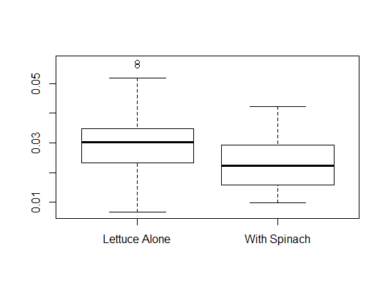
> mean(lettuce$dry.weight)
[1] 0.02808667
Here we have two groups of lettuce, those in competition with spinach and those that were not in competition. We will compute the mean of the dry weight for each group with the function
aggregate and a formula notation.
> aggregate(dry.weight~status,lettuce,mean)
         status dry.weight
1 Lettuce Alone   0.030308
2  With Spinach   0.023644
lettuce.
> aggregate(dry.weight~status,lettuce,sd)
         status  dry.weight
1 Lettuce Alone 0.010895231
2  With Spinach 0.008567676
boxplot function.
> boxplot(dry.weight~status,lettuce)The above command will produce comparative boxplots of the dry weight according to status. In the second argument, we give the name of the dataframe. The above command produced the following boxplots.
Keywords: read.table, indices, boxplot, summary, aggregate
x is a numerical vector. To build a histogram for x, we use the command hist(x) and for a boxplot, we use the command boxplot(x).
read.table.
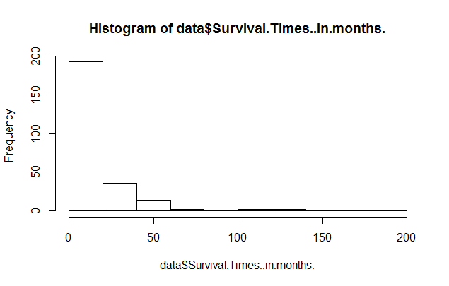
> data = read.table(file.choose(),header=TRUE,sep="\t")
> names(data)
[1] "Survival.Times..in.months."
Comments:
donnees and the dataframe has one column called "Survival.Times..in.months.".
data$Survival.Times..in.months.
> ncol(data)
[1] 1
> nrow(data)
[1] 250
So the dataframe called
data has 1 column and 250 rows (for the 250 patients).
> hist(donnees$Temps.de.survie..en.mois.)Here is the result:
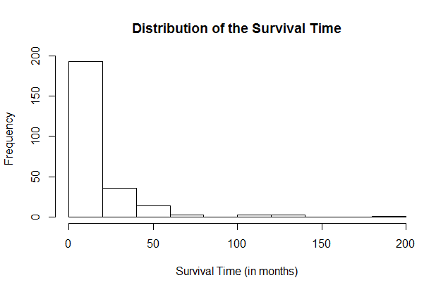
hist(data$Survival.Times..in.months.,
xlab="Survival Time (in months)",ylab="Frequency",
main="Distribution of the Survival Time")
Here is the result.
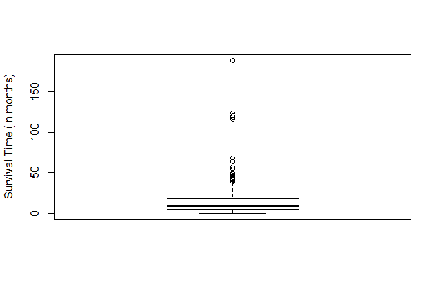
boxplot. Consider the following command:
boxplot(data$Survival.Times..in.months.,ylab="Survival Time (in months)")Here is the result.
> source(file.choose())R will open a window and we will select the file
plots.r. To verify that the file has been properly sourced,
consider the following command:
> BoxPlot
function(x, ...)  UseMethod("BoxPlot")
If we see function(x, ...) UseMethod("BoxPlot"), after entering BoxPlot at the prompt,
then we have access to the function BoxPlot.
We use the function BoxPlot just like the function boxplot. But, BoxPlot uses quantiles of type 6.
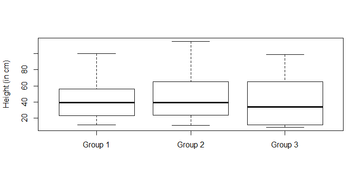
> x=c(12,13,24,56,100,45,67,45,34,23)
> y=c(11,14,24,57,115,65,67,45,34,24)
> z=c(12,34,56,34,99,98,65,34,23,11,10,9,23,65)
We are now ready to build comparative boxplots with the
boxplot function.
> boxplot(x,y,z)Remark: R will call the groups 1, 2, and 3, respectively. We can modify the names of the groups with the
names
argument. We can also add a label to the vertical axis with the ylab argument. Here is the command that we used to produce the comparative
boxplots that are found below.
boxplot(x,y,z,names=c("Group 1","Group 2","Group 3"), ylab="Height (in cm)")
> source(file.choose())
> source(file.choose())R will open a window and we will select the file
plots.r. To verify that the file has been properly sourced,
consider the following command:
> BoxPlot
function(x, ...)  UseMethod("BoxPlot")
If we see function(x, ...) UseMethod("BoxPlot"), after entering BoxPlot at the prompt,
then we have access to the function BoxPlot.
We use the function BoxPlot just like the function boxplot. But, BoxPlot uses quantiles of type 6.
data.
> data = read.table(file.choose(),header=TRUE,sep="\t")Remarks:
> nrow(data)
[1] 365
header=TRUE to indicate to R that in the file, we put the names of the columns in the first row. We use the
function names to display the names of the columns.
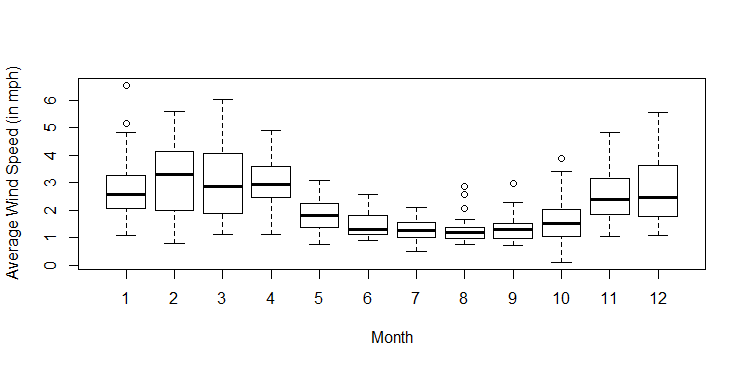
> names(data)
[1] "Avg.Temp...C."  "Avg.Temp...F."  "Avg.Wind..mph." "Precip..in."    "Day"            "Month"
[7] "Season"
We observe that there are 7 columns.
y and a group variable x in the dataframe data.
To produce side-by-side boxplots for y according to the levels of x, we use
boxplot(y~x,data)
boxplot(Avg.Wind..mph.~Month,data)We add labels to the axes with the
ylab and xlab arguments. Here is the command and the corresponding comparative boxplots.
boxplot(Avg.Wind..mph.~Month,data,ylab="Average Wind Speed (in mph)",xlab="Month")
plots.r, then we could use the function BoxPlot in exact same way as the
function boxplot except that the quartiles would be based on quantiles of type 6.
BoxPlot(Avg.Wind..mph.~Month,data,ylab="Average Wind Speed (in mph)",xlab="Month")
a+x        # add a to each component
a*x        # multiply a to each component
x/a        # divide each component by a
x+y        # add the vectors component-wise
x*y        # multiply the vectors component-wise
log(x)     # apply the natural logarithm to each component
sqrt(x)    # apply the square root to each component
x^a        # apply the exponent a to each component
abs(x)     # apply the absolute value to each component
Here are two useful functions:
sum(x)       # the sum of the components of x
length(x)    # returns the number of components
> x = c(10,100,2,5,16)
> y = c(1,0,-2,1,0)
> a= 2
We can use the function
length. We observe that both x and y are of length 5 (i.e. each have 5 components) and
a is of length 1.
> length(x)
[1] 5
> length(y)
[1] 5
> length(a)
[1] 1
a is a vector of length 1. We can verify that it is indeed a numerical vector.
> is.vector(a)
[1] TRUE
> is.numeric(a)
[1] TRUE
> x
[1]  10 100   2   5  16
> y
[1]  1  0 -2  1  0
> x+y
[1]  11 100   0   6  16
> x-y
[1]   9 100   4   4  16
> x*y
[1] 10  0 -4  5  0
> x/y
[1]  10 Inf  -1   5 Inf
> a
[1] 2
> x
[1]  10 100   2   5  16
> x+a
[1]  12 102   4   7  18
> x-a
[1]  8 98  0  3 14
> x*a
[1]  20 200   4  10  32
> x/a
[1]  5.0 50.0  1.0  2.5  8.0
abs that computes the absolute value on each component of a vector. Similarly, sqrt and log
give the square root and the natural logarithm (i.e. log to the base e) of each component of a vector.
> y
[1]  1  0 -2  1  0
> abs(y)
[1] 1 0 2 1 0
> x
[1]  10 100   2   5  16
> log(x)
[1] 2.3025851 4.6051702 0.6931472 1.6094379 2.7725887
> sqrt(x)
[1]  3.162278 10.000000  1.414214  2.236068  4.000000
We can also compute powers.
x^2 computes the square of each component of x.
> x
[1]  10 100   2   5  16
> x^2
[1]   100 10000     4    25   256
> y
[1]  1  0 -2  1  0
> y^2
[1] 1 0 4 1 0
x by using the above operations and verify that it computes the same as the var() function.
> x-mean(x)
[1] -16.6  73.4 -24.6 -21.6 -10.6
We now square the deviations away from the mean.
> (x-mean(x))^2
[1]  275.56 5387.56  605.16  466.56  112.36
We now compute the sum of the squared deviations away from the mean.
> sum((x-mean(x))^2)
[1] 6847.2
We now need to divide this sum by n-1.
> sum((x-mean(x))^2)/(length(x)-1)
[1] 1711.8
So the sample variance is 1711.8. We will now use the function
var() to verify that it does compute the sample variance.
> var(x)
[1] 1711.8
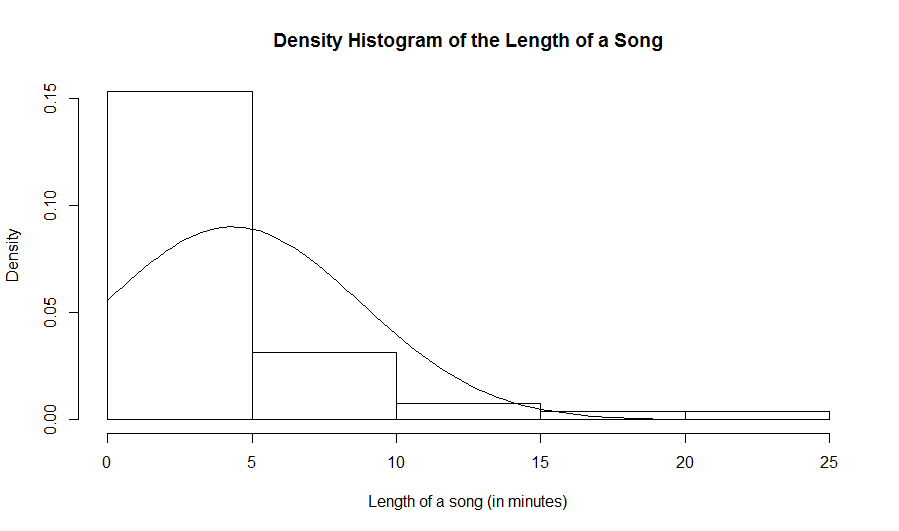
nv be a numerical vector. Then, hist(nv) produces a frequency histogram for this numerical vector. To get a
density histogram, we use hist(nv,prob=TRUE). (It gives a histogram where the total area of the rectangles is 1.)
read.table and we display the names of the columns.
> data = read.table(file.choose(),header=TRUE,sep="\t")
> names(data)
[1] "Length"
We observe that there is one column that is called "Length". It represents the length of a song in minutes. We verify that there is indeed only one column and compute the number of rows in the dataframe.
> ncol(data)
[1] 1
> nrow(data)
[1] 51
So there are 51 rows. These are the statistical units. In this case, they are male crickets. To display the 51 lengths of songs, we enter the name of the column at the prompt. Remember: To access a column in a dataframe, we use the (name of the dataframe)$(name of the variable). Here is an example:
> data$Length
 [1]  4.3 24.1  6.6  7.3  4.0  2.6  4.0  3.9  9.4  6.2  1.6  6.5  0.2  2.7 17.4
[16]  5.6  2.0  3.8  1.2  0.7  1.6  2.3  3.7  0.8  0.5  4.5 11.5  3.5  0.8  5.2
[31]  2.0  0.7  1.7  5.0  2.8  1.5  3.9  3.7  4.5  1.8  1.2  0.7  0.7  4.2  4.7
[46]  2.2  1.4 14.1  8.6  3.7  3.5
What are the numbers in the square brackets? These are the indices for the first values in the row that is displayed. For example, we see the valeu 2.2 that is beside [46]. This means that 2.2 is the value in the 46th row in that column.
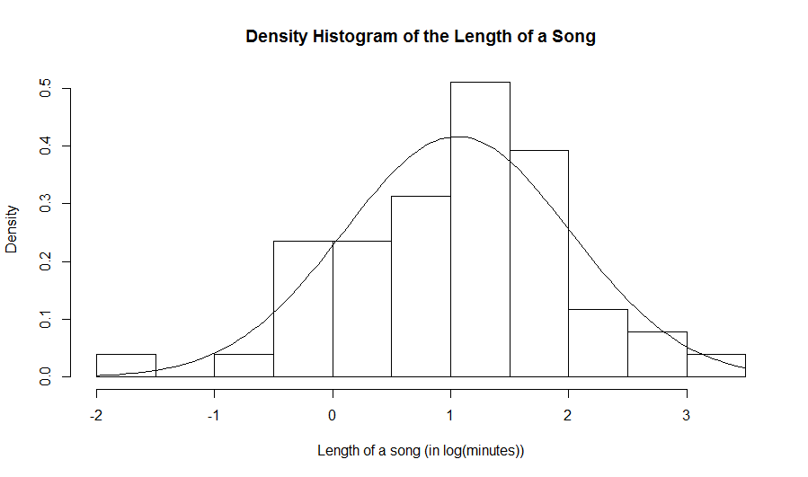
hist(log(data$Length),prob=TRUE,xlab="Length of a song (in log(minutes))", main="Density Histogram of the Length of a Song")
curve(dnorm(x,mean(data$Length),sd(data$Length)),add=TRUE)Note: that
dnorm stands for normal density. We need to also give R the mean and the standard deviation as arguments in the function
dnorm. Since in general, we usually do not know the mean and the standard deviation of the population, we will use estimates. That is, we
will use the sample mean and the sample standard deviation for our numerival vector.
hist(log(data$Length),prob=TRUE,xlab="Length of a song (in log(minutes))",
main="Density Histogram of the Length of a Song")
curve(dnorm(x,mean(log(data$Length)),sd(log(data$Length))),add=TRUE)
Here is the resulting histogram:
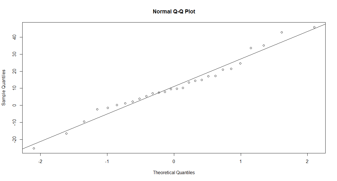
x=c(15.0, 15.3, 16.1,  5.4, 14.7, 14.7, 14.6, 13.8, 14.0, 14.6, 16.3, 18.6, 15.3, 15.3, 15.7, 10.7, 12.9, 15.3, 13.7, 14.1, 13.7,14.8, 16.8, 16.2, 16.0)
y=c(11.7,  9.4, 11.0,  9.6,  6.2,  7.4, 12.6,8.2,  9.1,  9.7,  9.6, 11.6,  9.5, 12.1,10.2,  6.1, 11.8,  9.6,  7.4, 10.4)
w=c(30.1, 30.1, 37.8, 38.3, 34.5, 31.9, 41.2,30.3, 30.0, 30.1, 34.7, 30.8, 30.7, 33.4,30.7, 30.2, 34.0, 33.7, 31.9, 30.7)
qqnorm to build a quantile-quantile plot to assess normality. The following commands were used to build
a quantile-quantile plot for y and to overlay a line onto the plot. We use the mean as the intercept and the standard deviation as the slope of the line.
> qqnorm(y)
> abline(mean(y),sd(y))
Here is the corresponding qq-plot. There is a linear tendency in the qq-plot with a small deviation in the tail, so it is reasonable to assume that it is a sample from normal population.
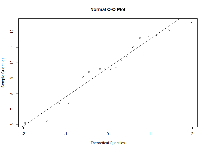
> summary(y)
   Min. 1st Qu.  Median    Mean 3rd Qu.    Max.
  6.100   8.875   9.600   9.660  11.150  12.600
The 50th percentile for our sample is 9.66. But the 50th percentile for a standard normal is z=0. So we correspond 9.66 on the vertical axis with 0 on the horizontal axis. The 25th percentile for our sample is 8.875. But the 25th percentile for a standard normal is about z=-0.674. So we correspond 8.875 on the vertical axis with -0.674 on the horizontal axis. And so on.
> qnorm(0.25,0,1)
[1] -0.6744898
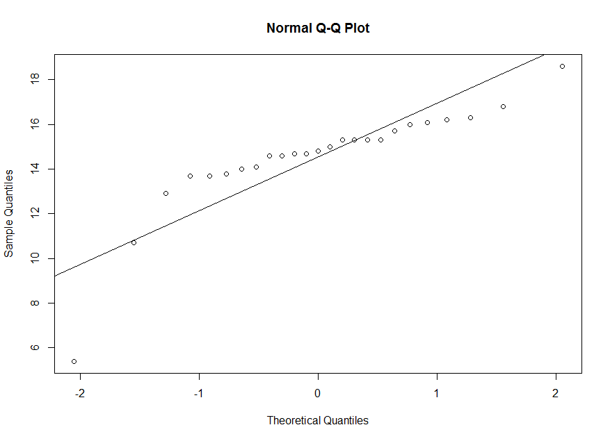
x. We observe a deviation from the line in the plot. So it is not reasonable to assume that x is a
sample from a normal population.
> qqnorm(x)
> abline(mean(x),sd(x))
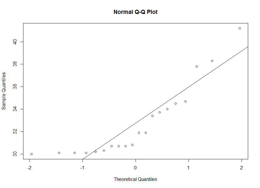
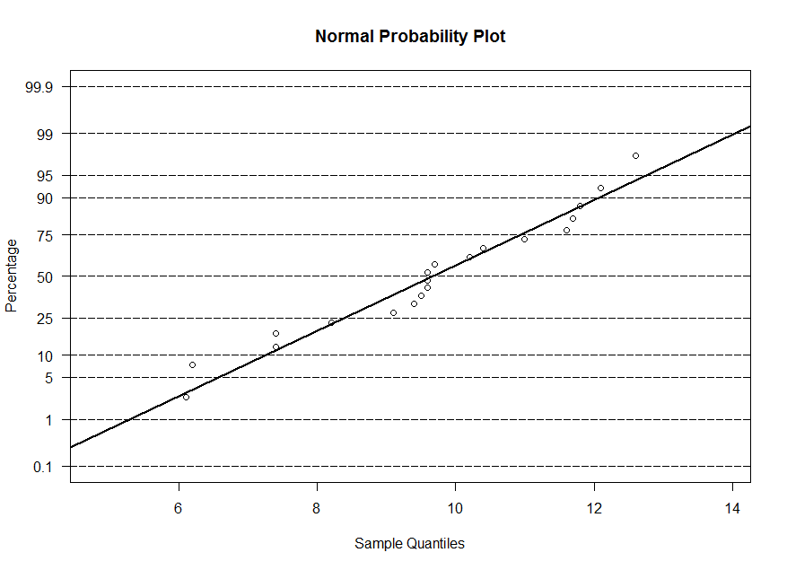
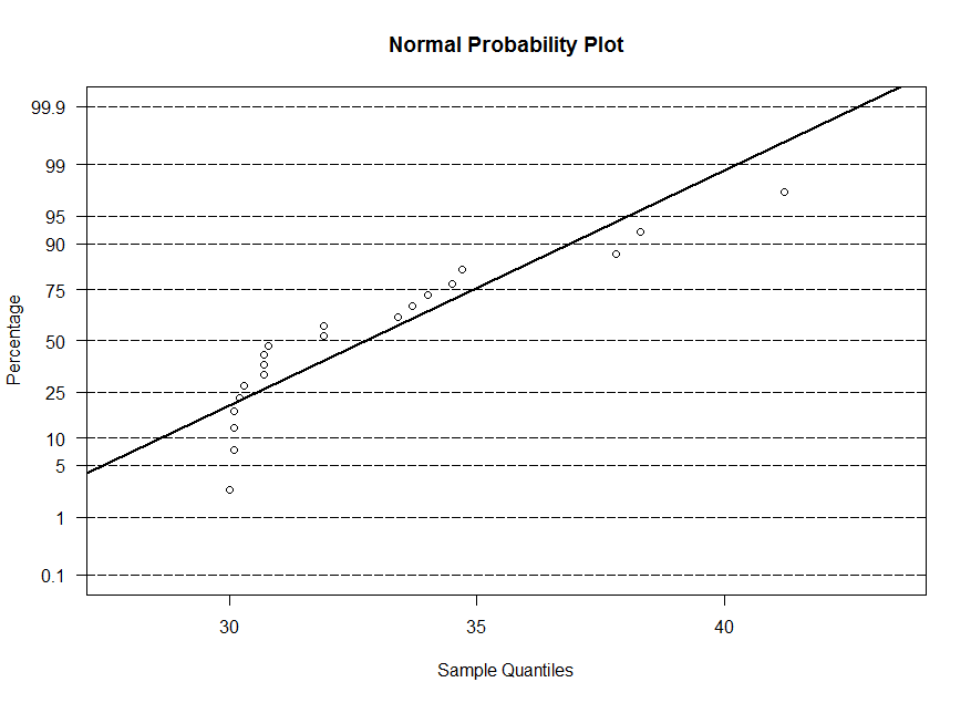
w. We observe a curvilinear tendency in the plot.
So it is not reasonable to assume that w is a sample from a normal population.
> qqnorm(w)
> abline(mean(w),sd(w))
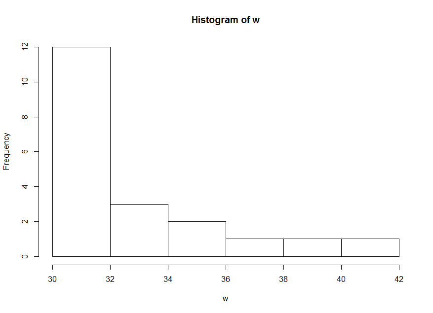
w, we observe that its distribution is highly skewed.
dataand display the names of the columns. There are three columns. The first is an identifier of the patient. The other two columns are pain scores under different treatments (placebo and methadone). We compute the difference between the pain scores and we would like to assess the normality of this difference.
> data=read.table(file.choose(),header=TRUE,sep="\t")
> names(data)
[1] "patient"   "placebo"   "methadone"
> d=data$placebo-data$methadone
> qqnorm(d)
> abline(mean(d),sd(d))
Here is the corresponding qq-plot. The tendency in the qq-plot is linear. So it is reasonable to assume that the difference between the pain scores is normally distributed.
ppnorm.
plots.rand verify that we indeed did source it properly by entering the command
ppnorm.
> source(file.choose())
> ppnorm
function(x, ...)  UseMethod("ppnorm")
Remark: If you properly sourced the file plots.r, then you should see function(x, ...) UseMethod("ppnorm"), after you enter ppnormat the prompt. The usage of the function is
ppnorm(x), where x is a numerical vector.
x, y and w. The normal probability plot is similar to the qq-plot, however the sample
quantiles are on the horizontal axis and for the theoretical quantiles, we display the corresponding probability instead of the value of z. At z=0, we have 50%, at z=1.645, we
have 95%, and so on. So the plots are equivalent. The line that is superimposed is a line with -(mean/std. dev.) as the intercept and 1/(std. dev.) as the slope.
> ppnorm(x)
> ppnorm(y)
> ppnorm(w)
c() function:> x=c(10.03,9.84,9.94,9.84,10.12,9.94,10.01,10.08,10.13,9.91, 9.94,9.95,10.09,9.97, 10.11, 10.06, 10.00, 10.03,9.89, 10.02)Note that the name that we gave the numerical vector is
x.
t.test.
> t.test(x,mu=10)

        One Sample t-test

data:  x
t = -0.25259, df = 19, p-value = 0.8033
alternative hypothesis: true mean is not equal to 10
95 percent confidence interval:
  9.953569 10.036431
sample estimates:
mean of x
    9.995
Comments:
x.
x:
qqnorm(x)
abline(mean(x),sd(x))
We produce the qq-plot at 1:47 in the video. The
abline(mean(x),sd(x)) command overlays a line onto the qq-plot with an intercept equal to mean(x)
and with a slope equal to sd(x).
conf.level equal to the confidence level that you want to use, for instance 0.98. We can
also only display the confidence interval without the t-test by adding the symbol $ followed by conf.int.
> # for a 95% CI
> t.test(x)$conf.int
[1]  9.953569 10.036431
attr(,"conf.level")
[1] 0.95
> # for a 98% CI
> t.test(x,conf.level=0.98)$conf.int
[1]  9.944731 10.045269
attr(,"conf.level")
[1] 0.98
> data = read.table(file.choose(),header=TRUE,sep="\t")
> names(data)
[1] "concentration"
data$concentration.
t.test function, we use the argument alternative="less" for a left-sided alternative and we use the argument
alternative="greater" for a right-sided alternative.
> t.test(data$concentration,mu=65,alternative="less")

        One Sample t-test

data:  data$concentration
t = -3.1816, df = 59, p-value = 0.001168
alternative hypothesis: true mean is less than 65
95 percent confidence interval:
    -Inf 62.5629
sample estimates:
mean of x
 59.86667
Note that for the 95% confidence interval, we get a one-sided confidence interval (all of the error is place on one side).
We are 95% confident that the mean concentration is less than 62.6 ppm. So we can conclude that we are 95% confident
that the mean is less than 65.
> t.test(data$concentration,mu=65,alternative="greater")

        One Sample t-test

data:  data$concentration
t = -3.1816, df = 59, p-value = 0.9988
alternative hypothesis: true mean is greater than 65
95 percent confidence interval:
 57.17043      Inf
sample estimates:
mean of x
 59.86667
Note that for the 95% confidence interval, we get a one-sided confidence interval (all of the error is place on one side).
We are 95% confident that the mean concentration is greater than 57.2 ppm. So we cannot conclude with confidence that the mean is greater than 65.
> data = read.table(file.choose(),header=TRUE,sep="\t")
> names(data)
[1] "patient"   "placebo"   "methadone"
We assign the column called placebo to
x and the column called methadone to y.
> x=data$placebo
> y=data$methadone
> t.test(x,y,paired=TRUE)

        Paired t-test

data:  x and y
t = 3.6471, df = 27, p-value = 0.001117
alternative hypothesis: true difference in means is not equal to 0
95 percent confidence interval:
  4.867647 17.389496
sample estimates:
mean of the differences
               11.12857
The argument paired=TRUE tells R that we have a paired data.
t.test to test that the mean of the difference of the paired
measurement is zero against a two-sided alternative.
> t.test(x-y)

        One Sample t-test

data:  x - y
t = 3.6471, df = 27, p-value = 0.001117
alternative hypothesis: true mean is not equal to 0
95 percent confidence interval:
  4.867647 17.389496
sample estimates:
mean of x
 11.12857
> t.test(x,y,paired=TRUE,alternative="greater")

        Paired t-test

data:  x and y
t = 3.6471, df = 27, p-value = 0.0005585
alternative hypothesis: true difference in means is greater than 0
95 percent confidence interval:
 5.931183      Inf
sample estimates:
mean of the differences
               11.12857
> t.test(x,y,paired=TRUE,alternative="less")

        Paired t-test

data:  x and y
t = 3.6471, df = 27, p-value = 0.9994
alternative hypothesis: true difference in means is less than 0
95 percent confidence interval:
     -Inf 16.32596
sample estimates:
mean of the differences
               11.12857
Keywords: paired t-test, numerical variable, t.test
> data=read.table(file.choose(),header=TRUE,sep="\t")
> names(data)
[1] "diameter" "age"
y and the age to the numerical vector x. Recall: It is name_of_dataframe$name_of_column.
> y=data$diameter
> x=data$age
y against x with an overlay of the least squares line.
> plot(x,y,ylab="Diameter (in inches)",xlab="Age (in years)")
> abline(lm(y~x))
Here is the scatter plot.
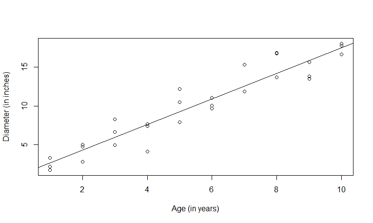
cor function. The correlation between the age and the diameter is 0.95. We can use the function
cor.test to test that the correlation is zero against a two-sided alternative.
> cor(x,y)
[1] 0.9508399
> cor.test(x,y)

        Pearson's product-moment correlation

data:  x and y
t = 16.247, df = 28, p-value = 8.72e-16
alternative hypothesis: true correlation is not equal to 0
95 percent confidence interval:
 0.8982861 0.9765752
sample estimates:
      cor
0.9508399
lm. It will give us the least squares line of y as a function of x.
The intercept is 1.003 and the slope is 1.647. We can put our linear model object into the summary function to get a description of the fit of the model.
> model = lm(y~x)
> model

Call:
lm(formula = y ~ x)

Coefficients:
(Intercept)            x
      1.003        1.647

> summary(model)

Call:
lm(formula = y ~ x)

Residuals:
    Min      1Q  Median      3Q     Max
-3.4606 -0.9010 -0.2029  0.6975  2.9225

Coefficients:
            Estimate Std. Error t value Pr(>|t|)
(Intercept)   1.0029     0.6290   1.594    0.122
x             1.6469     0.1014  16.247 8.72e-16 ***
---
Signif. codes:  0 *** 0.001 ** 0.01 * 0.05 . 0.1   1

Residual standard error: 1.595 on 28 degrees of freedom
Multiple R-squared:  0.9041,    Adjusted R-squared:  0.9007
F-statistic:   264 on 1 and 28 DF,  p-value: 8.72e-16
data.
> model = lm(diameter~age,data)
> summary(model)

Call:
lm(formula = diameter ~ age, data = data)

Residuals:
    Min      1Q  Median      3Q     Max
-3.4606 -0.9010 -0.2029  0.6975  2.9225

Coefficients:
            Estimate Std. Error t value Pr(>|t|)
(Intercept)   1.0029     0.6290   1.594    0.122
age           1.6469     0.1014  16.247 8.72e-16 ***
---
Signif. codes:  0 *** 0.001 ** 0.01 * 0.05 . 0.1   1

Residual standard error: 1.595 on 28 degrees of freedom
Multiple R-squared:  0.9041,    Adjusted R-squared:  0.9007
F-statistic:   264 on 1 and 28 DF,  p-value: 8.72e-16
